Have you ever fallen in love with a design scheme, recreated it in your bedroom and then found out you couldn’t relax? If so it is more common than you think. There are many times that we designers create rooms in model homes or for sales pitches that really aren’t suited for living in. The reason behind this…..sales are very different from use. So what color palette may intice you to buy something is very different from the color palette for you to relax in or work in.
A perfect example of this is using bright colors in a master bedroom. This is great to bright WOW factor to the space but it is not great for sleeping. For relaxing our brains want muted colors usually on the cool side of the color wheel.

Bright Green Bedroom

Soft Muted Bedroom
These are two perfect examples of a bedroom geared towards the WOW factor for sales one that would be relaxing to live it. In the soft, muted bedroom one’s brain will actually be triggered to slow down and relax getting one in the mood to sleep. While in the bight green bedroom the colors will actually stimulate the brain and keep one more awake. So for bedroom you want to focus on softer colors, neutrals with hints of color on the cool side, think blue, gray, pastel colors, and soft colors on the top range of a color fan.
For work spaces there are two colors that have been studied to make people more productive. These colors are yellow and grey. Both of these colors have shown improved produtivity. The belief is that yellow keeps people in a happier mood, which raises energy levels and in turn produtivity. For grey the thought is that there are no distractions and the mind can concentrate better leading to higher levels of productivity.

Yellow Office
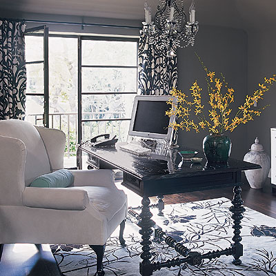
Gray Office
How about dining areas. Depending on the color you select you could find yourself eating more or less. If you want people to eat more paint the room red. If you want to eat less paint it blue. For this to make sense think about the colors of food. Watermelon, stawberries, tomatoes and apples are all red. They are sweet and are food that are good for you. The brain is programmed to see this color and become hungry. Now think about blue food. For the most part if food is blue it is moldy and not something that you want to eat. So your brian is programmed to see the color blue and not be hungry.
So remember that the color that you select for your space will determine how you will feel in the space. And if you are unsure of the color start with small things like pillows or one wall, then if you find it working go big!
Recent Comments