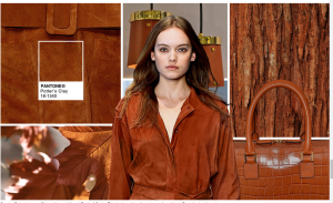
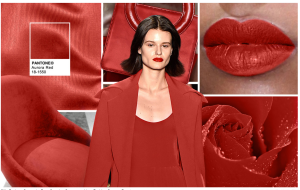
As we start to get ready for Furniture Fashion week (High Point Market) it is time to see what is going on at the fashion runways. I have for a long time talked about how design trends come from the runway. It used to be that we would see a trend on the runway and about a year later it wold be hitting the home furnishing market. As the world has opened up more and more with constant access to what used to be only for the most influential that time-table has become much smaller and we are seeing trends hit us almost immediately so I thought I would introduce the color trends we are seeing on the runway in anticipation of what we will be seeing in October.
The one thing that you will see on all of the trends is that it is all about deep rich colors. I personally think we got a big shock with the calm Pantone colors for 2016 as it was a bit off trend from where the market had been going. I think this is an adjustment back towards the deep rich colors. You will see that neutrals are deep neutrals. These are impactful colors with an opulence all to their own.

This takes Pantone’s serenity color and adds a depth and richness to be usable on many more projects.

Think back to Pantone’s color radiant orchid, this is an off shoot of that color. again deeper and richer and more versatile.

This reminds me of the 2015 color of the year Marsala. It is the perfect combination of red and brown with a depth and softness.

Another great warm color, great as a base color to work from. This color is very prevalent in high-end area rugs.

Blue, blue, blue. How can you go wrong with this classic, always in style. I love the touch of gray.

Lush, rich steel-gray. This adds so much to any design and does not lock you into a specific color scheme.

Bold and bright this yellow is not your everyday yellow. Opulent and upscale this the grown up yellow.
So what do you think we will be seeing at market with these great bold colors walking down the runway? I’m expecting to see lots of color. Opulent, deep colors with great textures. I expect there will be lots of velvet and flocking. Tweeds mixed with embroidery, linens and lush cottons are going to be the rage. Expect to see tassels and fringe and other embellishments. It is going to be lots of layering textures and colors and materials such as stone, wood and metal. Look for golds mixed with pewters and iron. Say goodbye to a lot of the overly minimal design and look for all the extras finding places throughout the industry.
Color is personal and unique. Let your personality shine through the colors you select for your home. Not sure how to do that? It’s time to bring in a designer to help your personality show throughout your home.


Recent Comments